TEMPLATE
I decided to start my website off by using a “start from scratch” template as I wanted create something really unique and not use a template that we easy to copy as having some thing generic was a concern of mine when I decided to use wix.
HEADER
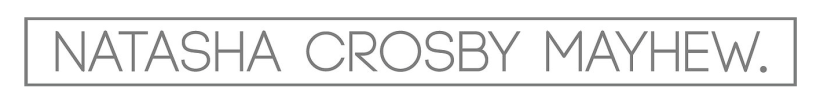
I started of by making a header, I knew I wanted this to include not particuly a logo as every logo I tried had to much detail so I just created a nice type that included my name and a full stop, I feel the capitals and the full stop felt bold and looked more like I was making a solid statement, As I wanted to use grey and white I did not want it to look to washed out so I decided to have quite a large stroke around the type face.
I decided to use this typeface (Code Light) as it looks simple and modernist although I had to put it into illustrator and change the leading slightly to give me the feel I wanted.
I decided to add a dose of colour I would add this bright arrow, I also felt like this would create more direction in my piece so that people would know to scroll down, I added a really simple, modernist arrow to stick to the theme of my website and my style as a designer.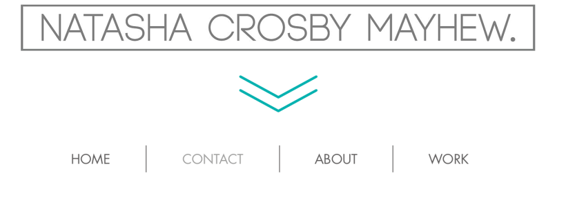
I then created really simple buttons using a similar typeface called futura to keep the same theme with very simple separators to make it more clear that they are separate buttons.
I made a separate drop down list to have the sections of my portfolio as I mentioned I have done this to make my website alot more accessible.
I have added this bar the the top of my page to give a very consistent title through out the site, I thought this was important after looking at other websites that have very consistent elements from page to page and it gives more of a flow to the website.
SLIDESHOW
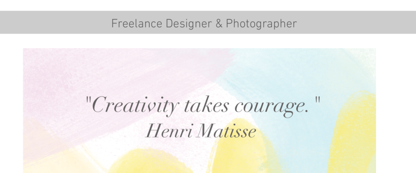
I created a slide show on the front page inspired by the Pearl Fisher website that fades really slowly,I did this with the animate tab on wix. I decided I wanted a really soft fade from image to image as it gives a nice feel to the website, also I feel if you have something moving on the website it feels less static, these are the images I includes into the slideshow, although this is mainly my work just to give a hint for this with the audience I have also included a quote that really inspires me as a designer as it just adds another element to the piece.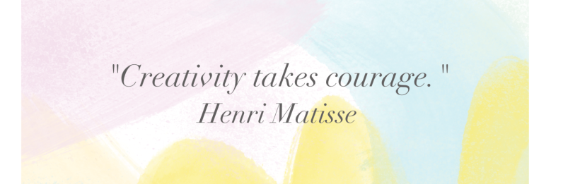
BOTTOM BAR AND SELECTION OPTION
This is also included on my home page, underneath the slideshow.
The images are actually links/buttons which makes another way to take you to the pages of my portfolio. I decided to add a short description, I made a very informed decision to make a concerted effort not to make my website to wordy.I wanted to just include a small bit of type to make a clear understanding to the audience so they can get even more information on what I do.
FOOTER
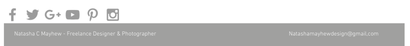
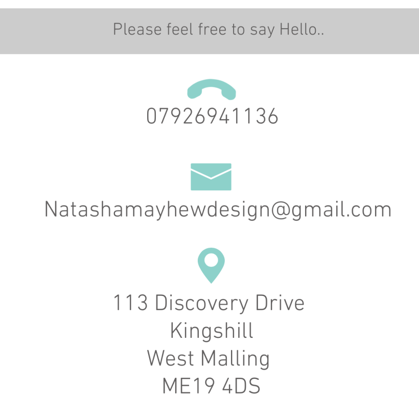
This footer will show on every page of the site.I have included my name, title and also my email address.I think when it comes to people contacted you this is usually the most professional way of communicating with clients.
I also included links to all my design accounts for social medias so that people can contact me through these medias and I can also keep them up to date with my new and upcoming work making them feel more included.
CONTACT
I have included the words “feel free to say hello” I felt this comes across more friendly and something I definitely wanted to portray in this page was an approachable feel.I decided from my research to use icons for this part of the website as they are more clear than using the words. I feel this works really nicely and keeps it simple and very easy to read for an audience.This also includes the footer which is on every page so this would show the social medias to be able to look at aswell.
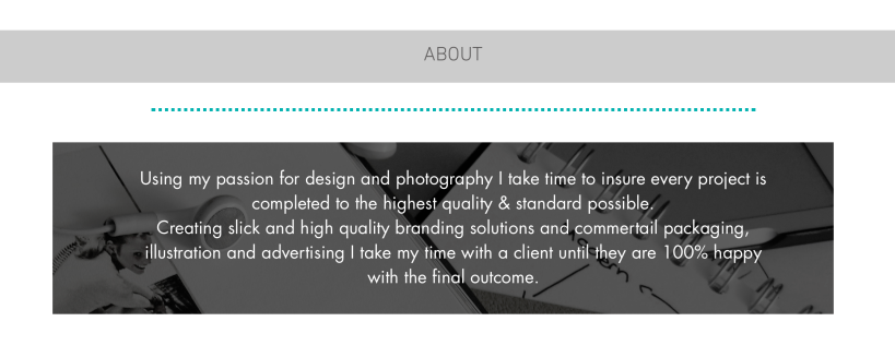
ABOUT
I again kept this really simple and darkened the background picture to enable the type to be seen more clearly.This picture behind reflects me as a designer, I always listen to music when I design something hence the headphone in the image and it also reflects the creative process by including a book (research) and a sketch/mind map (development/ideas) and then just the corner f my laptop to show making the final design. I included the line to separate it and also to carry on the colour theme.
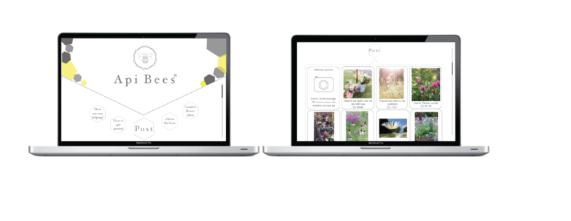
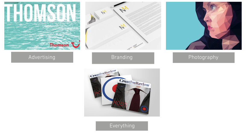
PORTFOLIO
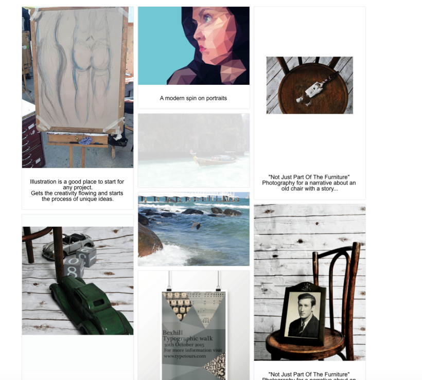
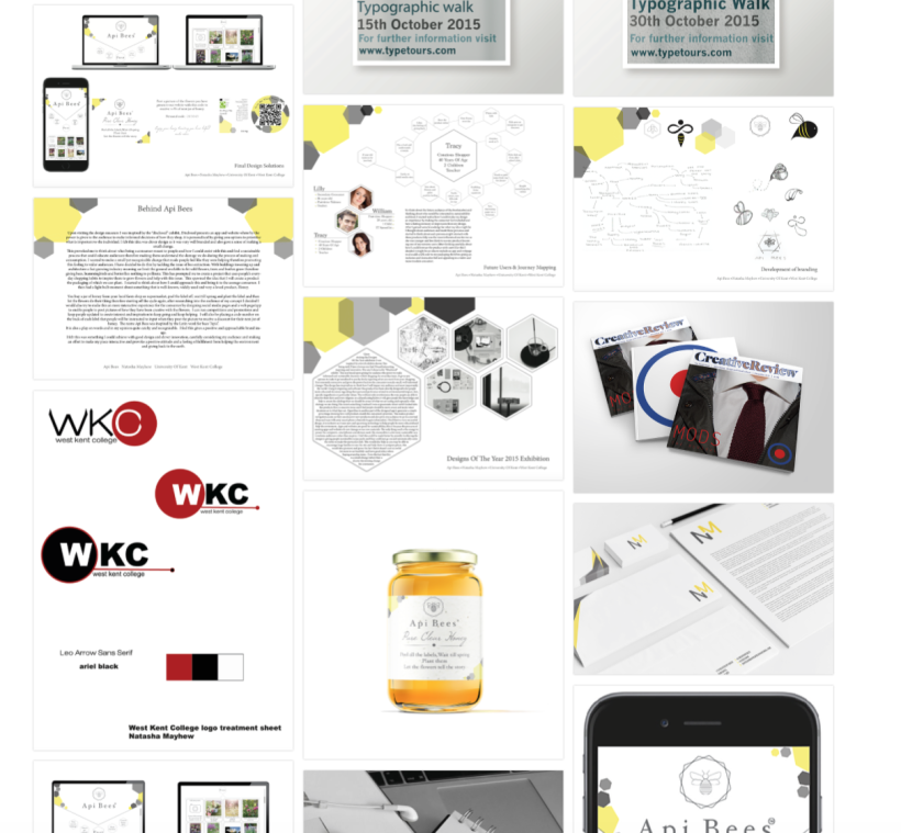
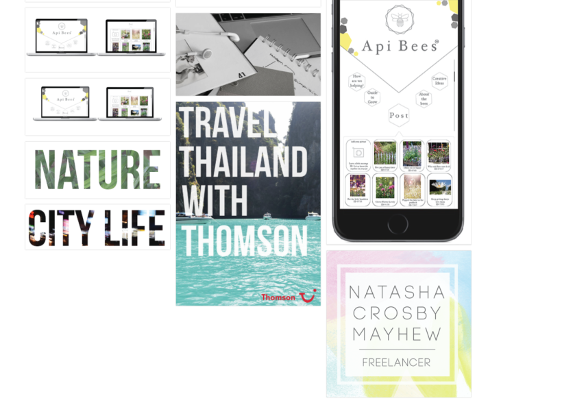
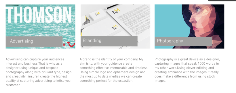
When you press on the “work” button it gives you an option to see a preview of the work as shown below, I feel seeing a small picture gives you more to decide what you would want to look at.The image and shapes can be clicked on to get to the pages or alternatively use the drop down menu.
PORFOLIO LAYOUT
This layout is inspired by other digital media and the way I felt that worked with the audience. I mainly took inspiration from pinterest as I wanted the audience to feel as if it was familiar for them so that they found it simple to look at.